
x
Graphic Design
Welcome to my world of ecommerce design! From site to email to social, I've worked on it all. Each brand I've worked on has asked for something different, and I've learned to morph my style to match.
Graphic Design
Welcome to my world of ecommerce design! From site to email to social, I've worked on it all. Each brand I've worked on has asked for something different, and I've learned to morph my style to match.
x
x
Graphic Design
Welcome to my world of ecommerce design! From site to email to social, I've worked on it all. Each brand I've worked on has asked for something different, and I've learned to morph my style to match.
Chinese Laundry and Dirty Laundry are super bespoke brands. Chinese Laundry was a more highend elegant brand, whereas Dirty Laundry was very grunge and cool. Both brands required me to push design boundaries at every turn. They wanted something new and different on every single email, which was a fun challenge.


Email Design
Click the email to view at full size.


ModCloth was unsure of their identity when I started on the brand. I helped pull them into a more set style, and often added hand drawn elements to the brand. I decided that every email was part of the ModCloth girl's scrapbook, that she would doodle in.
Not only did these elements make for a more cohesive brand style, they helped improve conversion. The brand started asking for hand drawn elements in their emails, because those emails regularly performed better then emails without.

Email Design
Click the email to view at full size. Some also include additional campaign emails and additional assets.


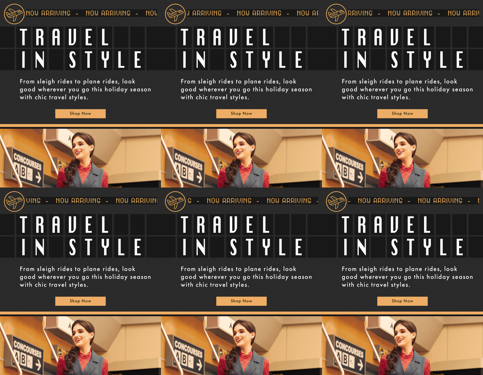

Karen Kane is a brand designed for older women who still want to look great, with an emphasis on coastal bohemian styles that are still elevated. I had been designing their site assets for a while when the brand asked us to take on their marketing assets. I noticed immediately that the previous design team had been using large text and bright colors, which took down the perceived price point of the brand and did not give off the effortless California vibe they were looking for. I also wanted to make the brand more cohesive, so I pulled in a paper texture that could be used season to season.

Email Design
Click the email to view at full size. Some also include additional campaign emails and additional assets.

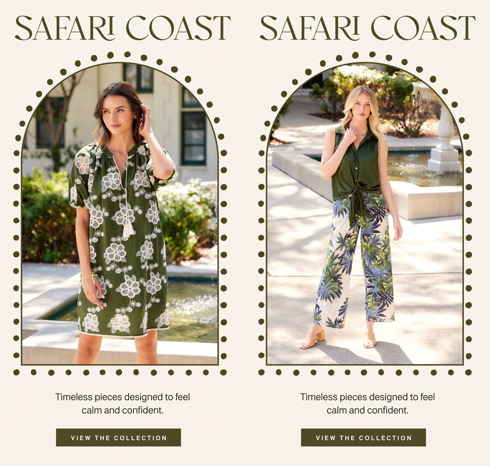


The Body Shop had shut down their American presence and was looking to come back. As such, they needed a lot of social content to relaunch their pages. This was my first time working on a beauty brand, but they allowed me a lot of creative freedom and I got to experiment with a lot of different design styles for Meta.

Social Design
Click to see the full size asset


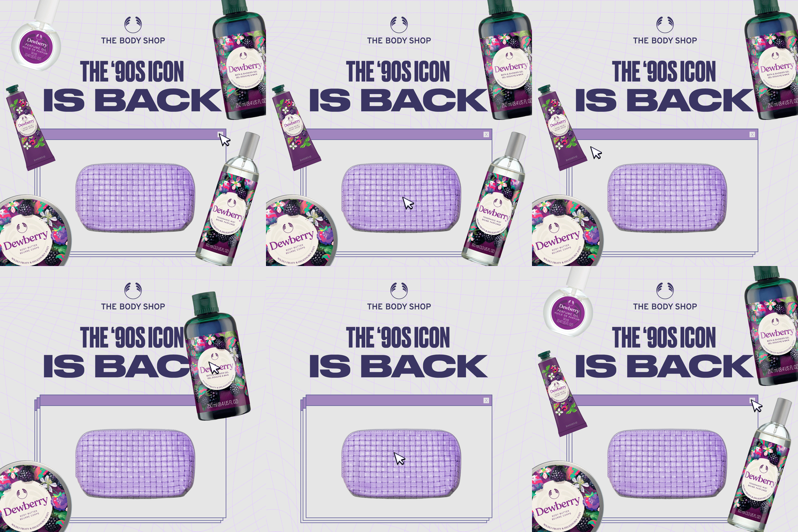
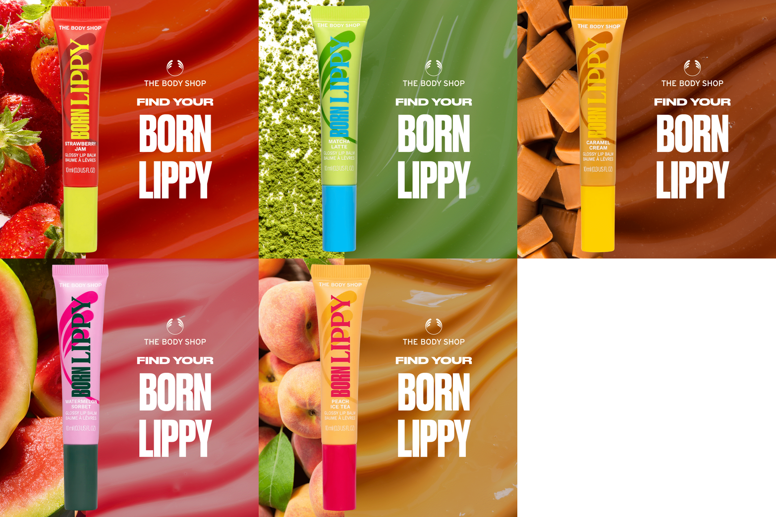
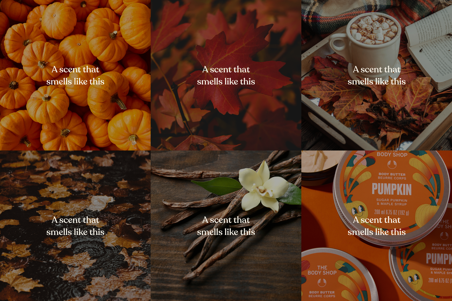
When the Body Shop returned to the US, they had the interesting challenge of merging a new audience with their existing audience. Despite having a backlog of imagery from their UK stores, the Body Shop had a major lack of lifestyle images. As such, I had the challenge of trying to make unique and fun designs with mostly product photography.
Email Design
Click the email to view at full size. Some also include additional campaign emails and additional assets.


